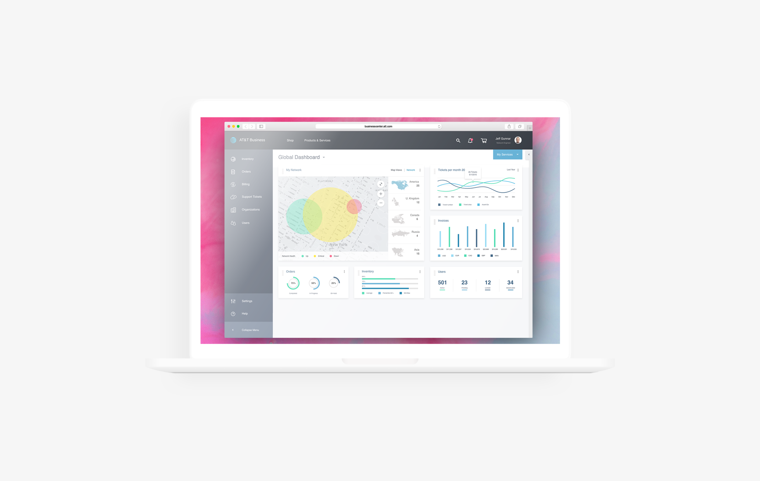
AT&T Business Console 2.0
OVERVIEW
This project was focused on mapping the current architecture for the Business Console’s device deployment set-up flow, to the new 2.0 design.
Business Console is a device management program and is complimentary for AT&T Business customers to help manage and control their mobile devices. Allows customers to push business applications, send messages to your devices, and run device status reports with this complimentary lightweight MDM solution.
ROLE
UX/UI Designer
June 2017

Background
The new 2.0 design was based off a design concept that was presented in a hackathon. All the UX designers on the B2B team broke into 5 groups.
The hackathon challenge was for each team to design a simplified experience for Business Center’s Collaborate users to ‘Create User’ flow. AT&T Collaborate is cloud-based solution that provides feature-rich voice and collaboration tools that can help improve customer engagement, drive employee productivity, and streamline operations.
Teams were asked to use our combined skillsets to deliver a beautiful, streamlined, user-focused enterprise tool. Everyone was to leverage their understanding of who our customers were, our business and our industry to help inform the work we presented.
Spoiler alert, My team won the challenge.
MY ROLE:
UX/UI Designer (Login/Dashboard)
TEAM MEMBERS
Courtney Hellums
Oluwaseyi Nayin
Gabe Quinones
Tvisha Nasit
Jayneil Dalala
Mark Rudd
Year
2017
Hackathon Challenge
Current design is driven by back-end and allows for a lot limitations with the current design standards. We set out to get break away from the business as usual layout and get a better understanding of our users needs and provide them with all the data/information in the current design.
Collaborate current design
Empathy Map
Our team took over an available room on a different floor and started looking through a usability report documented on Collaborate’s users. We drew the empathy map on the white board and we began writing what our users are doing, saying, thinking and feeling on post-it notes. After we finished this exercise we had a better understanding of the user’s pain-points.
Digital version of the empathy map
Brainstorming
I was tasked with the login and dashboard, so I began doing my research on dashboards and writing down any quotes that I found to be ah-ha’s. I then started sketching out layouts and writing down notes to have a better understanding on what the design could look like. This exercise helped with exploring ideas and what solutions would work best for the user.
Lo-fi’s
We set out to design with a responsive grid that would provide the user with more data and information they needed to manage their network. We made use of the extra real estate that wasn't being used in the current design layout for the 'Create User' flow. The UX Lead worked on the grid layout and a Sr. Designer worked on the ‘Create User’ flow.
Presentation
With our research findings and wireframes complete, we started designing the final product for our user's. While being tasked with the overall UI design, I chose to use a different color scheme than our normal design standards. Wanting to showcase a fresh new look that is welcoming and bright.
The current network’s data provided, helped me design an array of graphs for the overview of the companies progress that would our users what they had asked for. This redesign received a lot of good feedback from the rest of the team members, as well as our research team.
Hackathon Result
The response our designs received had management wanting to adopt it and set it to AT&T’s current design standards to meet CATO/e508 compliance. They had planned for it to be the new face of Business Center, known as Business 2.0.
FUN FACT: Not only did our team present a new design for AT&T Collaborate users to the rest of the team, we had another designer on the team create copy and record my voice to play over the presentation for a AI experience.
Business Console Process
Understanding the problem
Business Console’s current design is broken and difficult for the user to complete tasks. The center alignment design does not leverage more of the real estate and creates too much white space. The user is going through a step indicator to fill out a form, page by page with important data. This requires the user to have to retain the knowledge on what they previously filled out on the step prior.
A Sr. Designer (who was also my mentor) was assigned on executing the 2.0 design standards based off of my teams designs from the hackathon. He began redesigning Business Center, as well as creating new components. He approached me to help with the redesigning of Business Console.
I set time with the designers who were working on the product and had them walk me through the device deployment flow. I did a fair share of rounds with them, gaining the knowledge I needed in order to redesign it with the new 2.0 design standards.
Results and take aways
This new design would be responsive and developed like a CMS framework that unified all platforms
Some key takeaways:
Understanding multiple workflows and working with team members to find a solution to unify the experience
Utilizing existing components to create a new DLS that would improve the UI


