RIMS (Residual Incentives Management System)
OVERVIEW
This project took initiative in 2013 with IT designing the interface based off the BRD at the time. It was later shelved after 6 months. This time around we focused on researching to solve for how we would design flows to automate the incentive process by loading FCA (Fiat, Chrysler Automobiles) data directly through a web interface.
RIMS would eliminate the possibility for Santander Consumer USA and Chrysler Capital to erroneously change data contained in the excel file being used currently.
Problem
A large excel file for monthly incentives was being emailed back and forth every month between 4 different teams with 6 different people receiving and sending the file. This process takes a whole month for SC to finalize the incentives for the following month.
ROLE
Sr. UX/UI Designer and UX Researcher
April 2019 - Ongoing
Current Process
The current process has up to 7 excel files with vehicle data that can be received, and each contains 9 different tabs corresponding to each business centers (9 business centers). It makes it difficult to review all the data and increases the chances for human error while handling the files.
Each tab in the file can contain up to 86 columns an dup to 400 rows of data.
Research
In addition to being the Sr. UX/UI Designer for RIMS, I was responsible for carrying out the research process. Shortly after the stakeholder interviews were conducted, the UX researcher I was working with at the time, moved on to a new job opportunity.
I partnered with an IT Dev and a couple business owner’s for Chrysler Capital to join while I conducted hour long SME (subject matter expert) interviews, contextual inquiries, fly-on-the walls, and created personas for each team that is involved in the whole journey of the file process.
Personas
I created personas based off the SME interviews and contextual inquiries that were completed. Due to this project having confidential information most of it is blurred out. I color coordinated each persona to indicate if they were apart of the Chrysler Capital, Santander, or third-party team.
Journey Map
Created the journey map to show the file’s process from beginning to end to show stakeholders and other teams of the business how convoluted the process was. Indicated how long it takes at each touchpoint to make sure the incentives get published by their incentive period.
Current Application
Information Architecture
Organized the content to make the product easy to use and understandable.
Designs
RIMS is a large effort working with IT, and was broken up into 2 phases. For Phase 1, I gathered all the findings from my research, information architecture I designed, and looked over IT’s BRD and FSD (Functional Specific) documents. After I organized all the information, I began designing flows based off of businesses priorities.
Once hi-fi wireframes were completed, I would present to business for feedback and approval. The IT Dev that attended every meeting along the entire process took the approved wireframes and developed them in the dev environment. This allowed us to test a working prototype in a real-life environment.
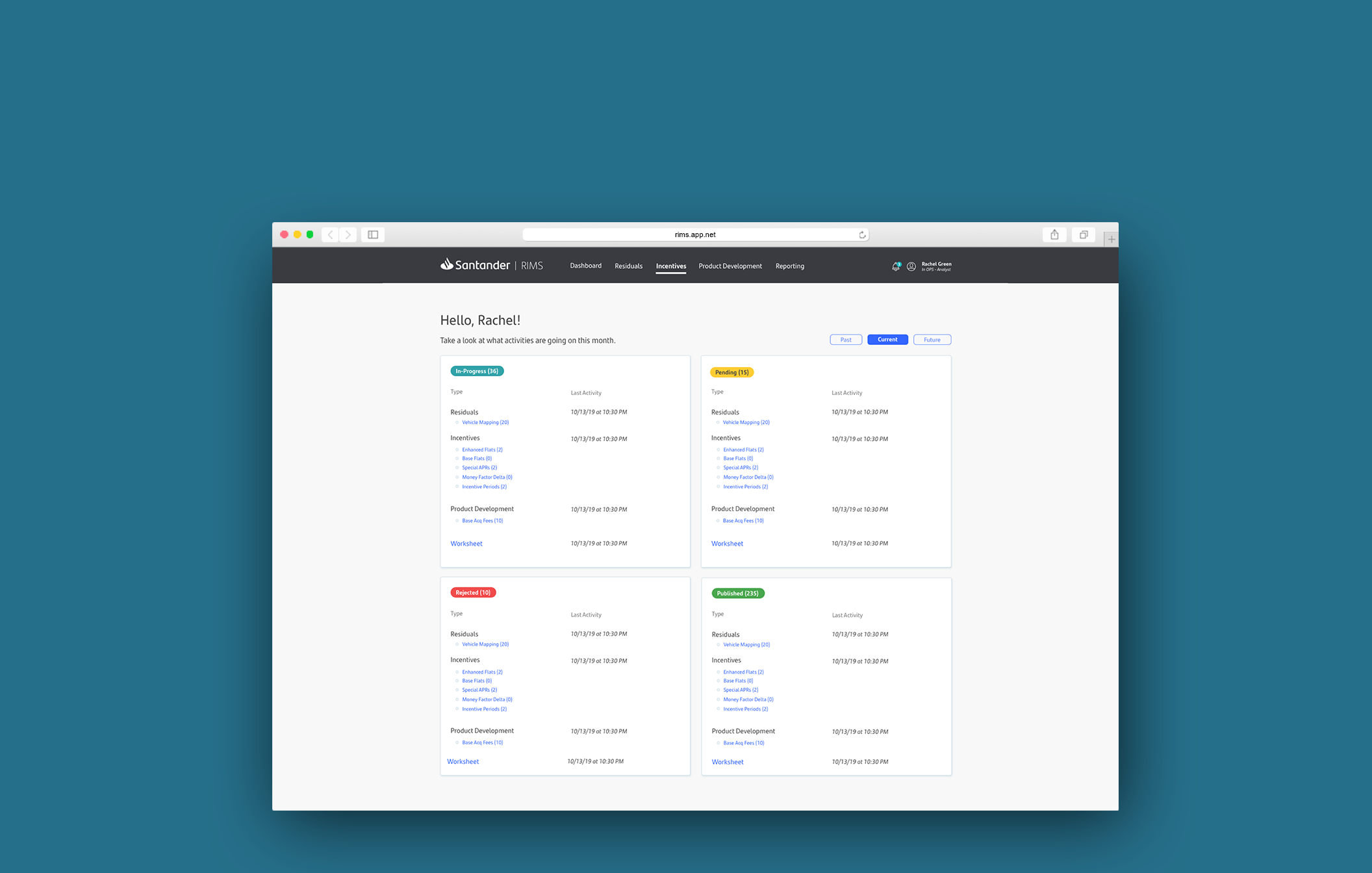
Incentive page
Users would come to this page to create and update changesets. A changeset is a collection of changes to files in a repository.
Changeset Summary page
This screen shows the user they can create a new attribute and that there is currently no changesets in-progress.
Create New form
Users fill out the required fields to create a changeset.
Changeset Summary page
Users will come back to the in-progress to see that their created changeset is in-progress. User will need to submit to get manager approval for the changeset to move along the workflow. If a manager finds a reason to not approve it, they will add a note and reject it. Then the card will indicate it was rejected and user can view notes to see what changes need to be made to resubmit.
Usability testings
Scheduled testings with analysts who would be using this web application. Studies were moderated by our UX Manager in person while I facilitated to take down notes from the observers. Participants were asked to fill out a survey at the end of testing to rate the current excel file process and then rate the new web application.
By the second round of usability testings we were fortunate enough to get a new UX researcher to jump in and take over the testings. Each flow went through two rounds of testings to iterate on the feedback we would receive.
Each flow was scoring 80-90 on the system usability scale developed by John Brooke.
Results and next steps
UX completed Phase 1 and did a hand off to the IT team. IT is in the process of mapping the front-end to the backend, and going through QA and UAT.
Phase 2 is being executed by another designer on the team.


